
ENTERPRISE PLATFORM UX · WORKFLOW OPTIMIZATION
Redesigning a Financial Data Platform End-to-End
Redesigned a legacy financial data governance platform used by a global life sciences enterprise — restructuring workflows, surfacing actionable work, and reducing average task complexity from 20+ screens to 5.

All visuals and examples in this case study have been redesigned to respect NDA constraints.
I worked with a team of UX designers on an internal financial data governance platform – used by a global healthcare company to manage and approve critical financial records.
The existing experience was a slow, legacy tool with workflows fragmented across multiple systems. Talking with users revealed that they were spending more time navigating the platform than actually doing their work.
ROLE
ux designer
TIMELINE
9 months (2024-2025)
SKILLS
user interviews
workflow mapping
information architecture
wireframing & prototyping
stakeholder collaboration
CHALLENGE
Users are responsible for managing dozens of financial data change requests governed by strict approval rules. The existing experience made this harder than it needed to be — workflows were fragmented across multiple systems, paths were complex and branching, and request ownership and status were hard to track.
MY ROLE
My role evolved over the course of the project, starting as a supporting designer before taking on design ownership for about four months. I ran one-on-one sessions with data stewards and SMEs and mapped existing workflows end to end, identified inconsistencies and opportunities to simplify, and iterated on solutions in Figma. As the team scaled up, I helped onboard incoming designers and get them up to speed.

Mapping the existing workflows revealed just how much branching complexity users were navigating every time they needed to complete a simple task.
CHALLENGE #1
Repurposing the landing page into an actionable surface
The legacy landing experience functioned like a dashboard, requiring users to navigate into categories to find their work. From talking to them, it became pretty clear that they usually entered the platform with a single question in mind:
What requests do I need to act on right now?
BEFORE

Rather than optimizing the existing dashboard layout, we redesigned the landing page around user intent and urgency, surfacing actionable requests and ownership signals immediately.
AFTER


ACTIONABLE REQUESTS FIRST
Surfaced request status and ownership upfront, so users could see what needed their attention without digging.

CATEGORY-FIRST NAVIGATION
Enabled quick entry into request or edit flows by surfacing master data categories upfront, making the system's structure legible from the start.

PERSONALIZED FOR REPEAT USERS
Added a 'My Favorites' section so daily users could pin frequently used categories and skip repetitive navigation.
Together these changes turned the landing page from a navigation problem into an actionable surface. Users could now see what needed their attention the moment they logged in.
CHALLENGE #2
Anchor workflows to data categories instead of actions
The original design was built with a focus on new users, with a guided path to help them figure out which data category they needed. But in practice, most users were subject matter experts who used the platform every day. The guided flow that was meant to help them was actually slowing them down.
BEFORE
Previously, workflows began with abstract actions (e.g. create, modify, delete), guiding users through decision trees to determine the correct master data category. Each path branched into 20+ screens, making simple tasks feel unnecessarily complex.

AFTER
By re-designing the entry point from abstract actions to directly surfacing all 27 master data categories, users could immediately select the workflow they needed. This created clear, linear paths per category and made workflows easier to navigate for both first-time and repeat users.

This reduced the average workflow from over 20 screens down to around 5 — a significant drop in complexity for users who were navigating these paths every single day.
CHALLENGE #3
Designing within platform and engineering constraints
Not every design decision is about the ideal solution. This project ran on a pre-existing enterprise component library with backend architecture already in progress, which meant some patterns we wanted weren't feasible to build.
BEFORE
One of the more complex parts of every workflow was the data input screen. In the existing experiences, users needed to 1. input their data on a screen
2. click a button to validate the data
3. click "next group" to go to the next set of data, and repeat the process 4-5 more times
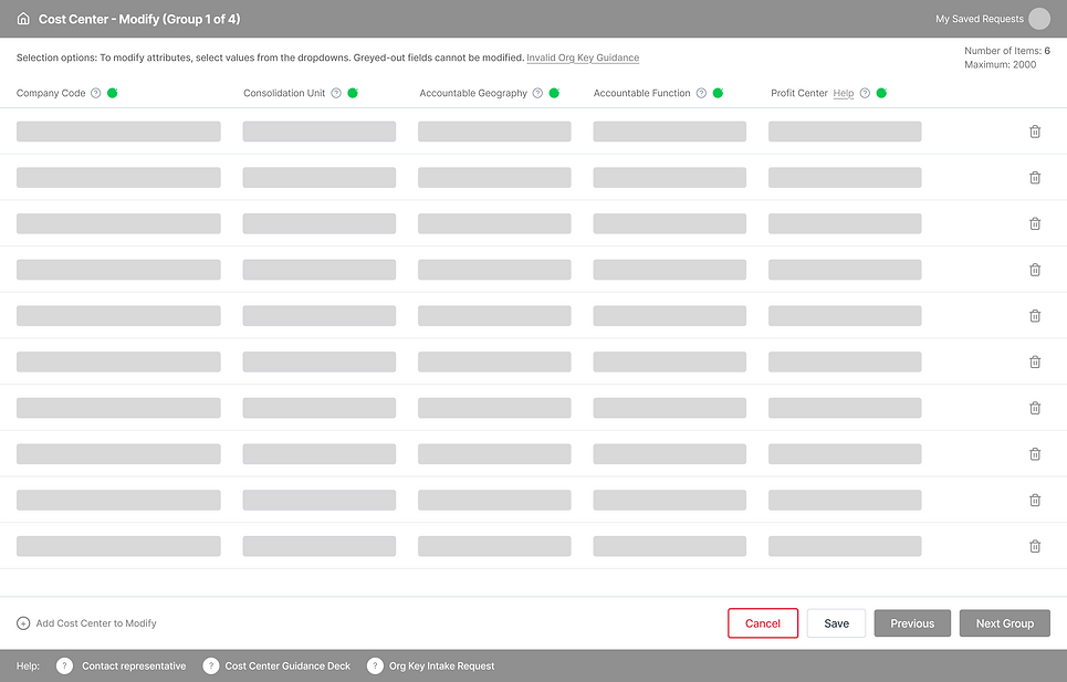
Ideally we would have redesigned the data entry experience entirely for a solution that would not require horizontal scrolling. However, the development team needed something close to an Excel-like experience since many users were mass-pasting data directly into tables. Rather than pushing for an idealized solution, we focused on the most impactful improvements we could realistically ship.
AFTER
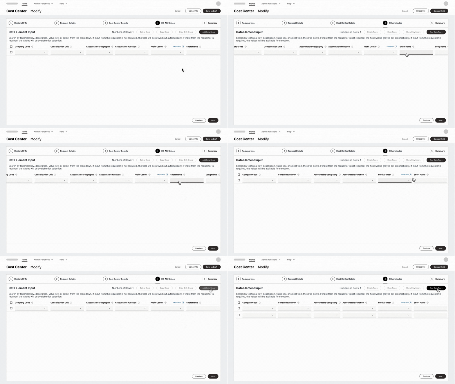
-
Consolidated multiple groups and pages into a single horizontally scrollable screen
-
Added explicit row actions (delete, copy, and add rows) that were previously buried or absent
-
Cleaned up table headers and consolidated instruction text above the table
-
Added a "Show Only Errors" toggle so users could filter to just what needed fixing
Working within constraints like these is part of enterprise design. The goal isn't a perfect interface — it's the best possible experience given what can actually be built.
Impact & Learnings
My work on this project contributed to clearer request ownership and status visibility, standardized workflows across 27 master data categories, and a more scalable foundation for future governance needs.
More than the design decisions themselves, this project taught me how important it is to really listen to users before designing anything. Understanding their actual pain points, not assumed ones, shaped every decision we made.
It also showed me that working within engineering constraints doesn't mean compromising on quality. We couldn't always build the ideal solution, but by staying close to the development team and understanding what was feasible, we found workable solutions that served everyone.